Dark mode and light mode are essential when it comes to user interface design. Designers follow website design best practices and always aim to provide user interfaces that are impressive and intuitive.
In the early design process it is crucial to focus on the color scheme of your website or app projects. Dark mode or light mode the essential deciding factors are highlights, effects and contrasts.
Dark mode might be preffered by someone with cataracts and related conditions while light mode is preffered by most because of the simplicity. Some also use dark mode for SEO and performance
But there is much to it. Any website may suffer with the use of colors alone. It may interact with the user’s ability to interact with the website and read the content. The special attention needs to be given on the impact of the dark and light themes.
Readability is fundamental and it affects how users interact with your digital product. It’s just not a digital cliche it affects how your website appears and performs. Performance, comprehension and satisfaction are all at stake.
What is a Light Theme?
A light theme is basically a theme that has a user interface design that has darker text and background. It is primarily light colored and is typically white or gray.
Light mode is widely preferred and improves the clarity which facilitates the user’s comprehension of your website.
Advantages:
- Improved readability in bright lighting
- Recognizable aesthetic appeal
- Improved contrast with primary hues
- Simplicity, neatness, and professionalism.
Disadvantages:
- Can result in weariness and eye strain
- Can be perceived as dull or overly simplistic at times
- May be overly vivid and intimidating for visitors
What is a Dark Theme?
A design that has a dark backdrop and graphics is known as a dark theme. It offers great contrast and helps users to focus on your website’s content. Visitors that spend good amount of time on your website can feel less weariness and strain with a dark theme. There are best website themes for dark mode and come with a lot of options.
Advantages:
- Decreased eye strain in dimly lit areas
- Distinctive visual appeal
- A striking contrast of colors
- Works better in bright environments
Disadvantages:
- More challenging to read the information
- Reduced effectiveness in bright settings
- Seems more complex
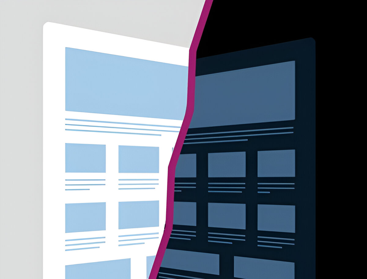
Dark Mode vs. Light Mode: Your Decision
It can be said that a light mode is preffered by many individuals as it improves visual performance. While as said some individuals with cataracts and other conditions might prefer dark mode.
The type and duration of use affects the benefits of dark mode vs light mode.It mostly depends on habits and personal use.
The overall efficiency of either mode can also be adjusted on Iphone by using True Tone or turning on Night Shift.
Conclusion
Several criteria determine the optimal option:
Environment: Dark mode performs better in less lit areas while light mode performs better in bright environments.
Personal Preferences: Light mode is a better option for certain people who find dark mode less pleasing.
The most responsible approach for UX designers is to provide both options, make them accessible, and allow the user to make the choice.